Why Your Graphic Organizer Isn’t Working for MLLs (And How to Fix It)
Graphic organizers are a staple of MLL instruction — and for good reason. They provide structure, break content into manageable chunks, and give students something to hold onto when the language demands of a task feel overwhelming.
But here’s what we see consistently in classrooms: a teacher distributes a Venn diagram or T-chart, students receive it, and then… not much happens. The organizer sits in front of them. They stare at it. Some write a word or two in the first box and stop.
The problem isn’t graphic organizers. It’s graphic organizers that haven’t been designed with MLLs in mind. The good news: the gap between a template that doesn’t work and one that does is smaller than you might think.
The Right Goal First
An effective graphic organizer for MLLs strips away difficulty — not thinking.
The thinking is the point. The graphic organizer’s job is to remove the obstacles that would prevent MLL students from getting to that thinking: linguistic confusion, procedural ambiguity, cognitive overload.
If a student can complete your graphic organizer without thinking, you’ve over-scaffolded. If they can’t figure out where to begin, you’ve under-scaffolded. The target is in between.
Seven Scaffolds That Make Graphic Organizers Actually Work
1. Chunking
Complex tasks have multiple parts. Strong organizers break those parts into discrete, sequential steps — one cognitive move at a time. Working memory is limited; when we ask students to hold multiple thinking tasks in mind simultaneously, we degrade the quality of thinking on all of them.
Instead of: “Write your argument.” Try: Box 1 — My position is... / Box 2 — One reason I believe this is... / Box 3 — Evidence from the text... / Box 4 — This evidence shows... because…
This is the same task but with far less overload.
2. Thinking Made Visible
The best organizers don’t just provide space for answers — they make visible the thinking process itself. Guiding questions and the overall layout clarify the sequence of thinking steps necessary for engaging in a complex task. Instead of simply filling in blanks, students are being apprenticed in how to approach the task in a logical sequence.
3. Visuals
Look for opportunities to reduce language load through visuals: a small illustration next to a key term, a completed example in a shaded box, a diagram that provides content context.
4. Clear Directions and Models
Every section needs brief, explicit directions — and where possible, a completed example. A shaded model answers questions about length, format, and expectations without requiring additional teacher explanation.
5. Language Frames
Rather than a blank line, offer a structure: “In my opinion, the most important cause of _____ was ______ because ________.” These frames don’t complete students’ thinking — they provide the linguistic architecture within which students express their own ideas.
6. Ample Space
A tiny two-line response box communicates that a short answer is expected. Students oblige. Generous space signals that deeper thinking and explanation are required.
7. Self-Contained
If a student reads the organizer carefully — directions, model, frames — they should have everything they need to understand what to do without asking the teacher. When the organizer isn’t self-contained, the teacher becomes the bottleneck. A self-contained organizer distributes that support across the page itself.
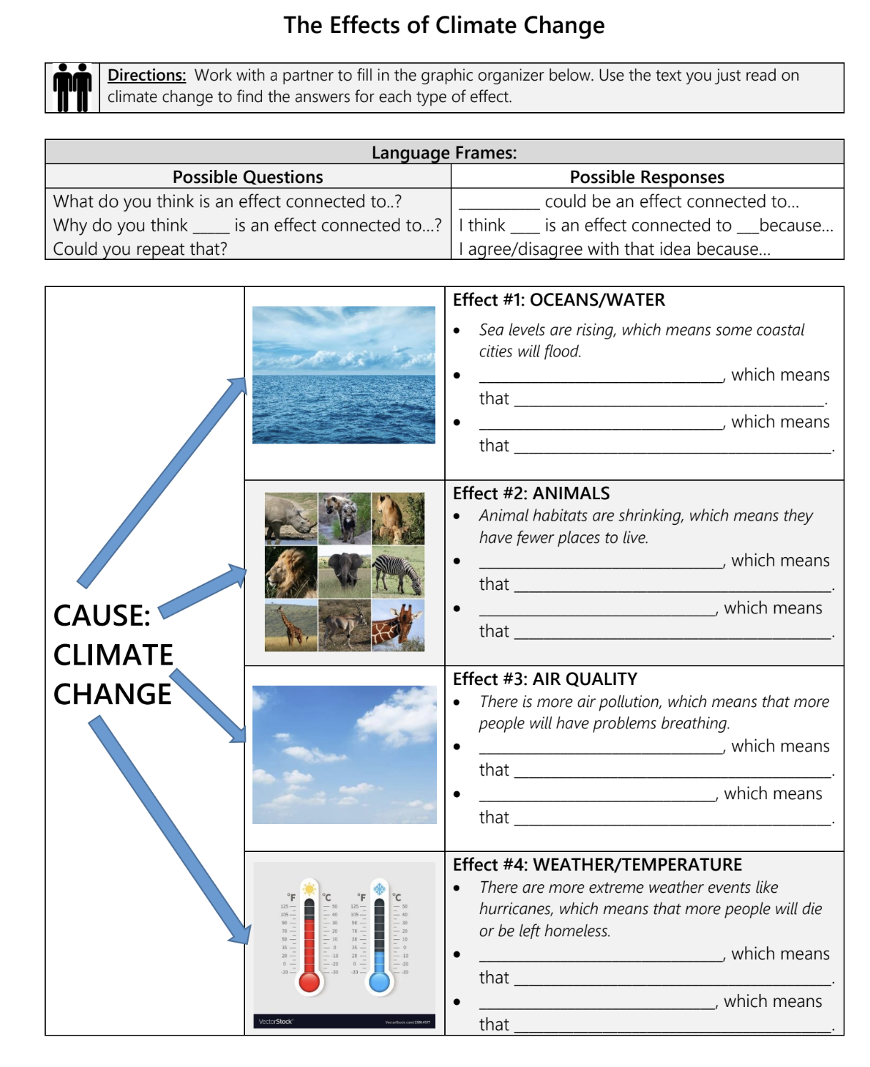
Compare this generic cause-and-effect graphic organizer

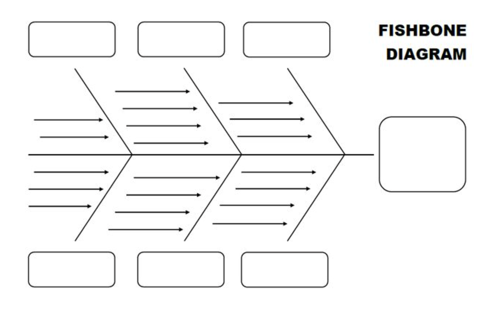
with this one that has been customized to a task - where students are taking notes on causes of climate change - and incorporates all of the above scaffolding moves.